I saw Michal Lukasiewicz’s work in acrylic that was figurative life study. His work has influenced me to blend more and not leave such bold shadow and highlight diversity. In other words blend more. My initial thoughts are to purchase hoghair fan brushes, but let’s start with my current non fan supply of brushes.
Blog
-
Human Skin: Shadow and Highlights
NOTE: MY NEXT PAINTING WITH SUBSTITUTE PHTHALO GREEN B. S., which is the original cool green I started with.
Thoughts on the skin shadow first, because that is where I start on a piece. The cool side of the shadow should be Viridian and a warmer green (Prussian Blue + Cadmium Lemon). On the opposite side (sun side) a warm purple (Winsor Blue R. S. + Cadmium Red) and (Prussian Blue + Permanent Rose).
On the highlight side, an orange like Cadmium Scarlet with Cadmium Yellow. Build warmth with Permanent Rose. Don’t, forget to use Yellow Ochre and Indian Red for the middle tones. Finish some edgework with Cadmium Lemon and Permanent Rose…keyed up.
Remember to add Ivory Black into all mixtures to knock them down. Similarly do this with Titanium White. Push and pull all the way until the end or finish approaches. Always finish with knife work. Do not forget to work with complimentary colors. Always think what compliment will work with the mixed color.
Stop watching YouTube videos and start painting or playing guitar. You waste so much time.
The idea is to put a small blob of paint on my palette, but also to put all my colors onto my palette. Use all the colors and control the subtle color choices and mixes with its compliment. This should lead to better color compositions and a measure of realism.
The work I did today/tonight was right where it should be. I’ve been progressing slowly towards a more realistic rendition of human flesh tone and trying to move away from sharp contrasty transitions high in chroma. I hope this latest piece exemplifies that trend.
-
Composition
When producing work… Artistic rendering or draftmanship… Use distinct lines to create a composition straight away. Once the compositional direction is chosen, then bring forth the image. Next choose color harmony to complete the dynamics. Remember and never forget the image lives independently of the source. Once removed it is an independent spirit.
For color harmony take a small section of image making in your head. Use your intuition and move forward. Let the color imagery sink in. Trust your gut, because that is you as an artist. In that way all the colors stay harmonized. As support use any handmade color charts you’ve made from the colors in your palette.
If I am to quickly render the composition with a few precise lines, as if I am drawing and not painting, then a round bristle brush would be used, preferably one size larger than you think.
In all my painting I should be tackling the visual question, “I want something”. This is as much of a question as it is a statement with an action attached to it.
I’ve got to make those faces emotionally darker and melancholy … More broken… More broken. -
Contour Figure Watercolor
Contour drawing coupled with watercolor painting on D’Arches 140 LB. CP. Done at the life study sessions. Think and pattern after Daniel Novotny’s watercolors. Bring gear + hair dryer.
Start boldly, then work back into subtleties. In the end more about removing and cutting back into the piece than adding.
Aquapasto is a watercolor medium that I have in my “kit”. Remember the YouTube video that explored this medium for watercolors. I can augment the watercolor to act like an acrylic where I can mix it like an acrylic apply somewhat thickly and finally cut back into it. Bring Chinese white with you for enhancement.
-
Ian Robert’s Transitional Colors
Ian Robert’s idea is found simply between the highlight and shadow is the transitional color. The transitional color is the most saturated of the three. The highlight is desaturated with white or a complimentary color getting more saturated as it approaches the transition between light and dark. Similarly, the shadow is most desaturated furthest from the transition from dark to light and most saturated as it approaches the transition from dark to light.
-
Bold Watercolor Face
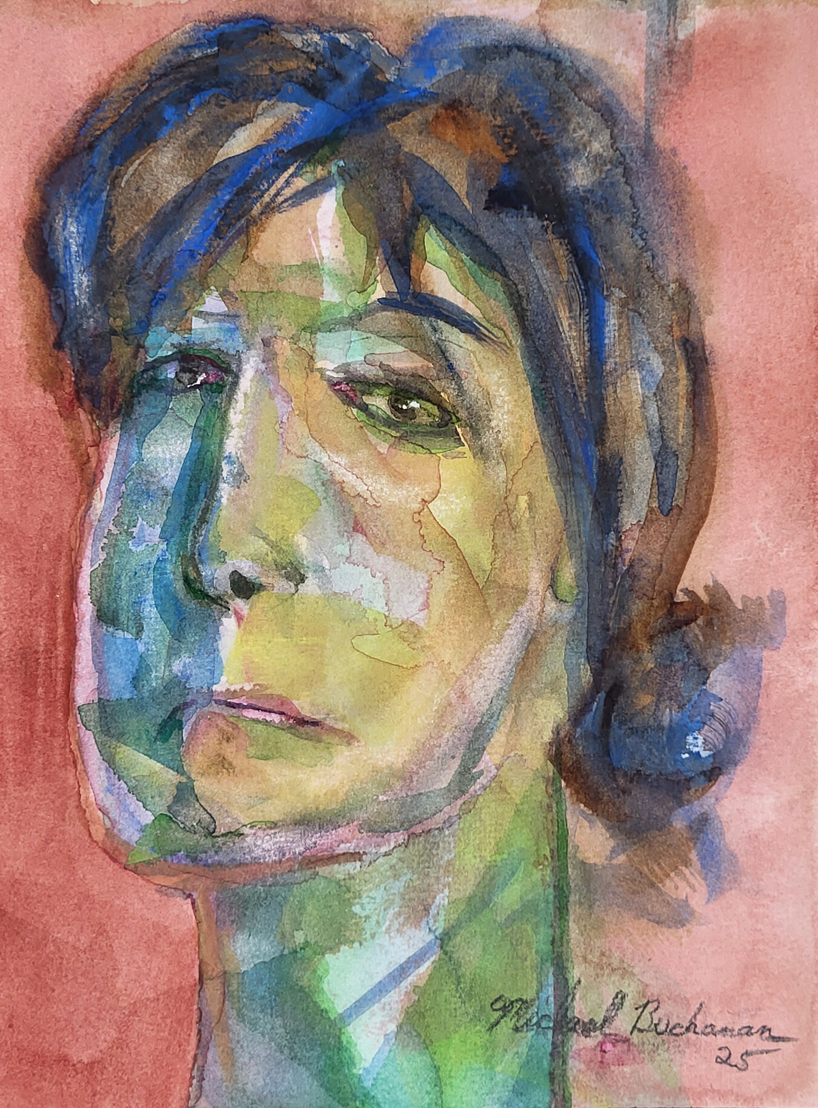
Bold Watercolor Face This image is originally from a life study worked on at the BCAC, Broome County Arts Council, in Binghamton, NY. The original drawing was completed on 6″X8″ Blick Premier 140 LB. CP. The method was direct using Winsor & Newton Artists’ Watercolors. Once the painting was roughed in during the life study on site, the piece was completed in watercolor paints in the studio. The colors I used were Permanent Rose, Genuine Alizarin Crimson, Scarlet Lake, Lemon Yellow, Raw Sienna, Burnt Umber, Viridian, Hooker’s Green, Cobalt Blue and Antwerp Blue.
-
Oil Painting and Blending Medium
Use the medium I purchased (Groves’ 19th Century Copal Varnish) a while ago to match John Fabian Carlson’s (mixed 50/50 with genuine turpentine). Use this medium throughout the painting process. Don’t forget to add linseed oil from layer to layer (fat over lean). Complete the piece as I do and wait 3 months, since last ending with the painting. After waiting until chemically dry, primarily that is the time to mix my glazing medium using Ralph Mayer’s recipe with stand oil. Wait another 3 months and varnish.
-
Large Watercolor
Full sheet 22X30 D’Arches 140 CP. In 4H pencil work out the composition (Golden Mean). Draw a figure from, Robert Beverly Hale’s book. Next do your landscape using muck colors.
-
Mi-Teintes
Work on Mi-Teintes paper in Charcoal. Lay down a layer of charcoal using the pounce bag. Begin using vine charcoal starting with the biggest size diameter reducing down to the narrowest diameter. These variations of circles represent landscape perspective. Highlights are the pure paper with no charcoal. Use the kneaded eraser to remove the charcoal. Draw the figure.
-
Watercolor Preparation
Use my Blick W/C block and halve the long side of the sheet with a pencil line. Complete the John Fabian Carlson’s sky colors on the sheet 2X. Have a portion masked off with frisket in the generic shape of a human. Let this dry in anticipation of Tuesday night. This will be the preparation for the Tuesday Life study.